Understanding color and the impact it has on our minds and attitudes is essential to making marketing-smart color decisions, both online and offline. Establishing this understanding is critical when seeking to bridge the gap between what you are trying to communicate and what is actually perceived. We’ve explored this reality with a few colors already—blue, red, green, yellow, black and white, and purple. Let’s now look at the psychology of the color orange and what it means for your business.
The color orange is a fun, dynamic color that tends to elicit strong reactions. A close relative of red, orange seems to spark more controversy than any other color. It’s bold, vivid, and obnoxious at times. And there is usually a strong positive or strong negative association – you either “love it” or “hate it.”
Orange signifies a rather interesting contradiction. The two primary ways in which the color communicates speak to two opposing ideas—activity and caution. Orange can encourage our attitude to be more energetic and lively, while at the same time can instill a sense of restraint. Without at least a basic understanding of how orange works, this conflicted color may lead to an unclear message.
The best use of orange to represent activity is its prevalent usage throughout dozens of sports teams. Some of these teams include the Baltimore Orioles, the San Francisco Giants, the Cincinnati Bengals, the Phoenix Suns, and of course, our favorite, the Syracuse Orange. The use of orange throughout these athletic brands may vary but the intended message is the same—the communication of energy, life, motivation, and activity.
Another subconscious association with activity that the color orange creates is through its occurrence within nature, specifically citrus. Tangerines, oranges, clementines, and nectarines are all naturally orange, yes, but they represent something deeper. As great sources of vitamin C, we’ve come to associate these fruits and the color orange with life and energy.
Orange seems to decorate our highways more and more. As a symbol of safety, orange is used to set things apart from their surroundings. Its use is usually found on traffic cones, stanchions, tow truck lights, barrels, and other construction zone markers. The vibrancy that orange exudes and the attention it demands to make it the ideal color for such scenarios.
Another use of orange as caution is that it means “high” in the color-coded threat system established by the presidential order in March of 2002. This system is designed to quickly inform law enforcement agencies when intelligence indicates a change in the terrorist threat facing the U.S. Orange is, therefore, a symbolic representation of potential danger.


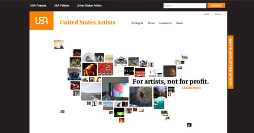
When using orange on the web, there are a few things to consider. As with most warm colors, it’s easy to overuse orange. Because of its energy and brightness, it can quickly become overwhelming, especially on screen. Therefore, it’s safe to use orange sparingly, more as an accent color, if anything. When used in moderation on calls to action on your website, orange will elicit the specific response you most desire. If you like using orange, sorry, but be prepared for orange haters. The following examples are two different approaches to orange on the web; one uses it sparingly and strategically, while the other uses it overwhelming


For help with branding and website design, contact FatRabbit Creative today.
We touched on two broad perspectives of the color orange, but there is a further conversation to be had about how orange communicates. So, why not continue the conversation? Share some of your experience with orange. Has it been positive or negative? Stay tuned as we continue to explore the complex nature of a specific color each month and its impact on our attitudes within today’s culture and economy.
Understanding color and the impact it has on our minds and attitudes is essential to making marketing-smart color decisions. Let’s now look at the psychology of the color orange and what it means for your business.
Ask us anything! We can’t wait to hear from you.
Get valuable tips and advice based on current best practices for all things digital marketing. Learn how the pros do it, and apply it to your business.